Conversion Optimisation
Conversion Optimisation
Reducing drop-off rate at a specific point in the onboarding flow
Reducing drop-off rate at a specific point in the onboarding flow
Reducing drop-off rate at a specific point in the onboarding flow
Reducing drop-off rate at a specific point in the onboarding flow
Reducing drop-off rate at a specific point in the onboarding flow
MY ROLE
MY ROLE
Delivery of key modules and features, UX / UI design, design systems, journey mapping, testing and data analysis, engineer handover
Delivery of key modules and features, UX / UI design, design systems, journey mapping, testing and data analysis, engineer handover
Delivery of key modules and features, UX / UI design, design systems, journey mapping, testing and data analysis, engineer handover
TOOLS USED
TOOLS USED
Figma, FigJam, Loom, Microsoft Clarity
Figma, FigJam, Loom, Microsoft Clarity
THE TEAM
2 designers, 2 clients, 2 internal stakeholders, 1 Engineer
2 designers, 2 clients, 2 internal stakeholders, 1 Engineer
2 designers, 2 clients, 2 internal stakeholders, 1 Engineer
2 designers, 2 clients, 2 internal stakeholders, 1 Engineer
TIMELINE
Mar - July 2023
Mar - July 2023
PLATFORM
Web App (Mobile / Desktop)
Web App (Mobile / Desktop)
What is craggle?
Craggle is a first-of-its-kind in the fin-tech space. Using the ‘power of the crowd’, users can choose to switch home loans via a quick sign-up process. This earns them the ability to get a better rate on their mortgage.
Craggle is a first-of-its-kind in the fin-tech space. Using the ‘power of the crowd’, users can choose to switch home loans via a quick sign-up process. This earns them the ability to get a better rate on their mortgage.
Tired of seeing people jump through hoops to get a home loan, Craggle has made the application process easy and fast.
Tired of seeing people jump through hoops to get a home loan, Craggle has made the application process easy and fast.
what does success look like?
The more people in each Craggle, the more banks will get involved, and the better rates the banks can give. Currently, 3 of the top 5 ‘big banks’ are working with Craggle.
The more people in each Craggle, the more banks will get involved, and the better rates the banks can give. Currently, 3 of the top 5 ‘big banks’ are working with Craggle.

Peter Hudson
peter hudson
38 years old
In a relationship
2 kids under 10
Home owner
With a current mortgage
38 years old
In a relationship
2 kids under 10
Home owner
With a current mortgage
38 years old
In a relationship
2 kids under 10
Home owner
With a current mortgage
38 years old
In a relationship
2 kids under 10
Home owner
With a current mortgage
38 years old
In a relationship
2 kids under 10
Home owner
With a current mortgage
Peter works full-time as a manager in a multinational company. He makes decent money, but he and his wife can only save small amounts. Peters’ wife also works full-time. They bought a 4 bedroom house 3 years ago and have felt the pinch with the latest bank interest rises. They are about to refinance their mortgage.
Peter works full-time as a manager in a multinational company. He makes decent money, but he and his wife can only save small amounts. Peters’ wife also works full-time. They bought a 4 bedroom house 3 years ago and have felt the pinch with the latest bank interest rises. They are about to refinance their mortgage.
“Banks make you jump through hoops of fire to get a home loan these days!”
“Banks make you jump through hoops of fire to get a home loan these days!”
“Banks make you jump through hoops of fire to get a home loan these days!”
“We had no choice but to upgrade our home. Our kids needed more space, and now we have a mortgage beyond our means”
"I worry about interest rate rises"
"I worry about interest rate rises"
"I worry about interest rate rises"
"I worry about interest rate rises"
“Banks are so old and stuffy. I would jump at the chance to work with a younger company who actually gives a sh*t about me!”
HOW PERSONA SHAPES CRAGGLE’S UI
HOW PERSONA SHAPES CRAGGLE’S UI
Tone of voice
Tone of voice
Fun, personable and simple. Craggle speaks to its users, in a tone of voice they can connect with.
Colour palette
Colour palette
Yes - green means money. The additions of blue, turquoise and red give Craggle a colour palette that feels trustworthy, fresh and fun.
Design styles
Design styles
Simple designs paired with cute friendly illustrations. This allows Craggle to be both serious and personal.
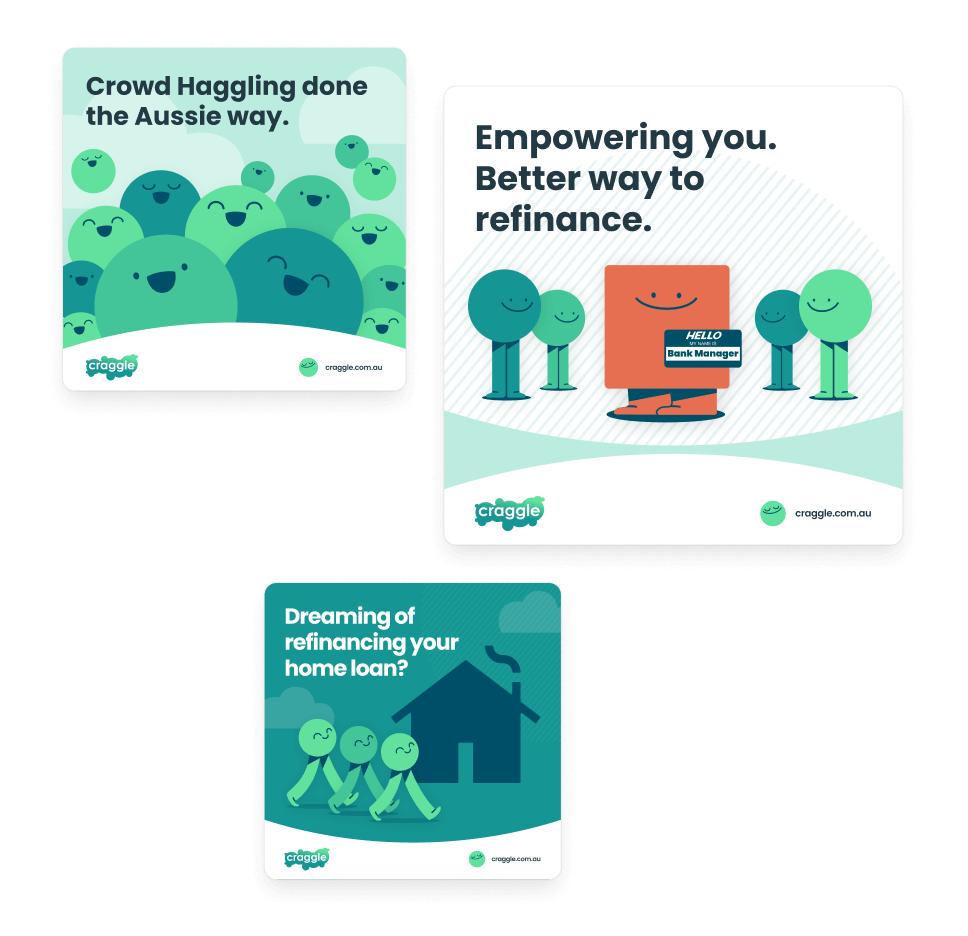
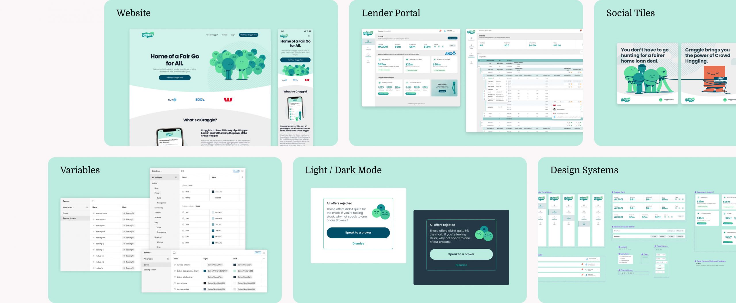
An overview of my UI design work for Craggle
An overview of my UI design work for Craggle
Craggle launched on the 24th of July, 2023 to an Australian audience.
After being live for 48 hrs - The engineers noticed that a large percentage of users submitted ‘about me’ info but nothing beyond that. Dropping off at the next screen (bank login).
Craggle was in its very first live ‘event’. The aim of this urgent project was to reduce drop-off rate at this specific pain point.
THE PROBLEM
Users wanting to sign up to Craggle are dropping off at the ‘bank login’ screen. This screen creates friction because people don’t like to give personal bank details to a 3rd party app.
Users wanting to sign up to Craggle are dropping off at the ‘bank login’ screen. This screen creates friction because people don’t like to give personal bank details to a 3rd party app.
Users wanting to sign up to Craggle are dropping off at the ‘bank login’ screen. This screen creates friction because people don’t like to give personal bank details to a 3rd party app.
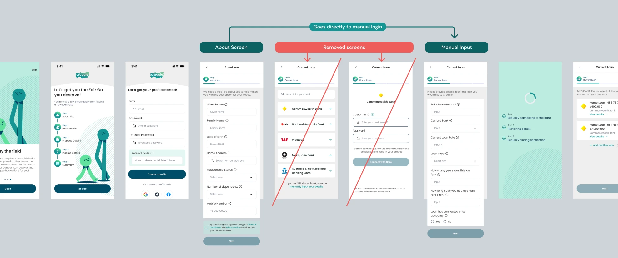
our HYPOTHESIS
What if we remove this friction point and send people directly into the manual entry flow? Entering the same info, but without logging in through their bank. We hypothesise that more users will continue through to the end of the flow and sign up.
What if we remove this friction point and send people directly into the manual entry flow? Entering the same info, but without logging in through their bank. We hypothesise that more users will continue through to the end of the flow and sign up.
Conversion Optimisation
To consider Craggle’s 1st event a success, we want to see a 30% increase in users signing up within 72 hours of this change.
To consider Craggle’s 1st event a success, we want to see a 30% increase in users signing up within 72 hours of this change.
To consider Craggle’s 1st event a success, we want to see a 30% increase in users signing up within 72 hours of this change.
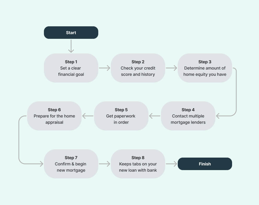
Step 1: Understand user journey in the current market
Step 1: Understand user journey in the current market
Step 2: Understand how Craggle can affect this journey
Step 2: Understand how Craggle can affect this journey
Step 2: Understand how Craggle can affect this journey
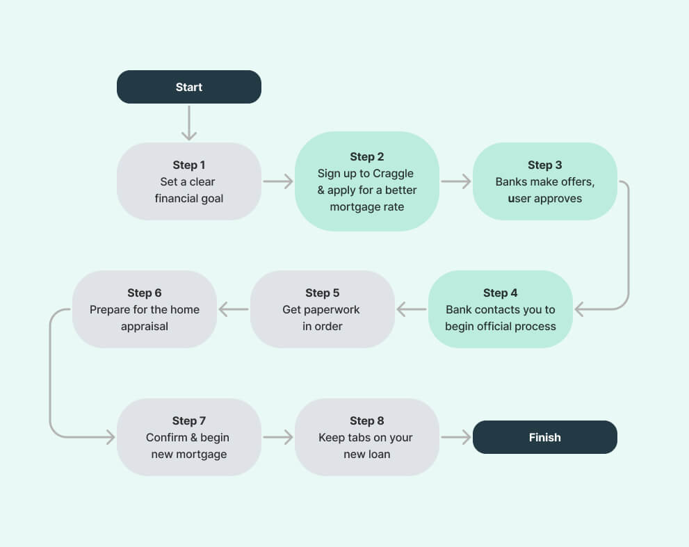
So what we can see here is ...
By using Craggle, a user makes the initial steps of re-mortgaging a lot easier for themselves.
- Without Craggle, customers approach different banks independently to search for the best rate.
- With Craggle customers get options at lower rates after a 20-minute sign-up process.
The power of the crowd: Craggle has done the hard work to build relationships with banks so the user doesn’t need to. Saving a lot of time and pain in the process.
Tracking dropoff within user onboarding flow
This high-level data was collated via Microsoft Clarity. URL parameters are used to track popular pages and locate user drop-offs during the first 48 hours of being live.
This high-level data was collated via Microsoft Clarity. URL parameters are used to track popular pages and locate user drop-offs during the first 48 hours of being live.
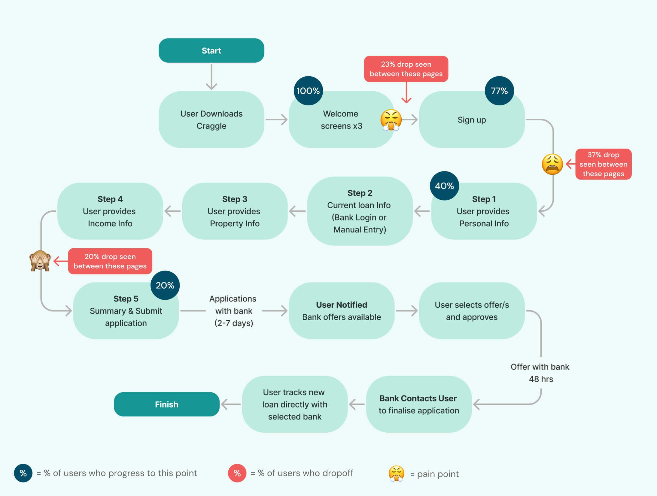
From this visualisation I can see ...
There are 3 main dropoff points:
There are 3 main dropoff points:
There are 3 main dropoff points:
There are 3 main dropoff points:
- 23% dropoff: User sign-up screen
- 37% dropoff: User providing personal info
- 20% dropoff: Before final submission
It is clear that item no. 2 is the most urgent so my next step was to observe user videos in Microsoft Clarity.
- 23% dropoff: User sign-up screen
- 37% dropoff: User providing personal info
- 20% dropoff: Before final submission
It is clear that item no. 2 is the most urgent so my next step was to observe user videos in Microsoft Clarity.
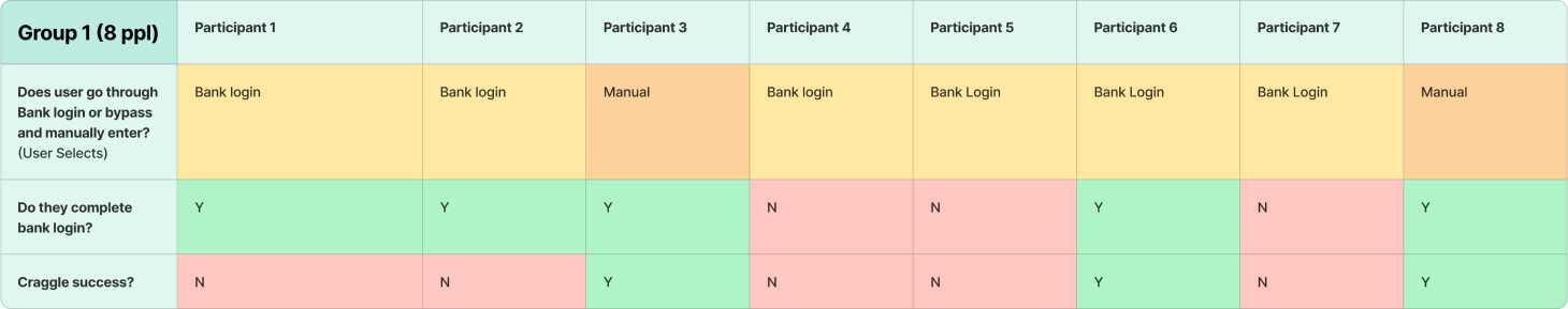
Group 1: pain points analysis
Group 1: pain points analysis
Confidentiality barrier
Confidentiality barrier
Confidentiality barrier
In 2023, users don’t give personal information to anyone, let alone a new app they are signing up to. Asking users to sign in via their bank login, is unexpected and users are clearly weary.
In 2023, users don’t give personal information to anyone, let alone a new app they are signing up to. Asking users to sign in via their bank login, is unexpected and users are clearly weary.
In 2023, users don’t give personal information to anyone, let alone a new app they are signing up to. Asking users to sign in via their bank login, is unexpected and users are clearly weary.
Confusion / trust with flow
Confusion/trust with flow
50% of users in Group 1 go ‘backwards’ and forwards in the flow from the bank login onwards. Something about the bank login seems confusing or untrustworthy.
50% of users in Group 1 go ‘backwards’ and forwards in the flow from the bank login onwards. Something about the bank login seems confusing or untrustworthy.
50% of users in Group 1 go ‘backwards’ and forwards in the flow from the bank login onwards. Something about the bank login seems confusing or untrustworthy.
50% of users in Group 1 go ‘backwards’ and forwards in the flow from the bank login onwards. Something about the bank login seems confusing or untrustworthy.
Issues with Information architecture & UI design
Issues with Information architecture & UI design
Users don't easily know there is a manual input button hidden at the bottom of the page. This needs to be improved.
Users don't easily know there is a manual input button hidden at the bottom of the page. This needs to be improved.
Users don't easily know there is a manual input button hidden at the bottom of the page. This needs to be improved.
Users don't easily know there is a manual input button hidden at the bottom of the page. This needs to be improved.
Users don't easily know there is a manual input button hidden at the bottom of the page. This needs to be improved.
After tracking a group of users, it was clear from my observations, there is a problem with the bank login screen.
- Bank Login: Of the 75% of users (x6) who opted to go through bank login, only 16% (x1) of the users signed up to Craggle.
- Manual Entry: Of the 25% of people (x2) who opted to manually enter details, 100% (x2) signed up to Craggle.
This data, alongside my higher-level analysis above, confirm that this change would likely be a positive move. This testing also helped identify other issues within the flow for future adaptations.
Next steps: Remove the bank login screen, and then observe another group of users
Group 2 results
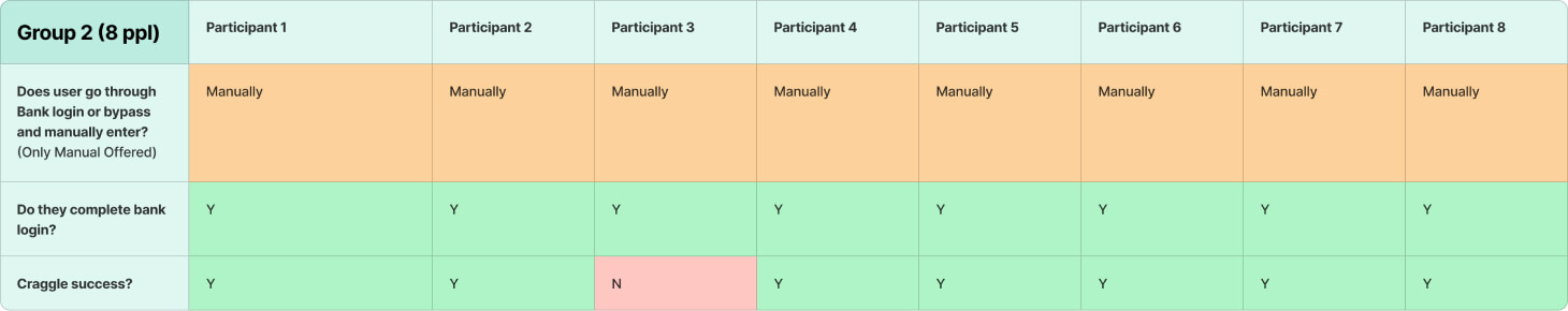
After tracking Group 2, it was clear we had made positive changes to Craggle’s final sign-up numbers.
- Manual Entry: 100% of people (x8) were sent into the manual entry flow, and 88% (x7) signed up to Craggle.
After tracking Group 2, it was clear we had made positive changes to Craggle’s final sign-up numbers.
- Manual Entry: 100% of people (x8) were sent into the manual entry flow, and 88% (x7) signed up to Craggle.
group 2: observing Clear results
Removing the option of bank login reduced the total drop-off rate from 63% to 12%. 51% more people complete their sign-ups as a result.
Removing the option of bank login reduced the total drop-off rate from 63% to 12%. 51% more people complete their sign-ups as a result.
Removing the option of bank login reduced the total drop-off rate from 63% to 12%. 51% more people complete their sign-ups as a result.
Removing the option of bank login reduced the total drop-off rate from 63% to 12%. 51% more people complete their sign-ups as a result.
Removing the option of bank login reduced the total drop-off rate from 63% to 12%. 51% more people complete their sign-ups as a result.
Our initial goal for this project was to see a 30% uplift in sign-ups. The 51% improvement was 21% higher than we had hoped, so the project was a success!
This change remained consistent in the data observed over the coming days in the live web app.
Our initial goal for this project was to see a 30% uplift in sign-ups. The 51% improvement was 21% higher than we had hoped, so the project was a success!
This change remained consistent in the data observed over the coming days in the live web app.
Our initial goal for this project was to see a 30% uplift in sign-ups. The 51% improvement was 21% higher than we had hoped, so the project was a success!
This change remained consistent in the data observed over the coming days in the live web app.
Our initial goal for this project was to see a 30% uplift in sign-ups. The 51% improvement was 21% higher than we had hoped, so the project was a success!
This change remained consistent in the data observed over the coming days in the live web app.
Suggestions for future iterations
These tests show me there is room for improvement in our flow. The next steps, are to present the data to the wider team. I will also bring suggestions on more ways we can improve the flow, such as:
These tests show me there is room for improvement in our flow. The next steps, are to present the data to the wider team. I will also bring suggestions on more ways we can improve the flow, such as:
These tests show me there is room for improvement in our flow. The next steps, are to present the data to the wider team. I will also bring suggestions on more ways we can improve the flow, such as:
These tests show me there is room for improvement in our flow. The next steps, are to present the data to the wider team. I will also bring suggestions on more ways we can improve the flow, such as:
These tests show me there is room for improvement in our flow. The next steps, are to present the data to the wider team. I will also bring suggestions on more ways we can improve the flow, such as:
Split test x2 bank login screen designs:
a. Manual input up higher / more obvious
b. Redesigned bank login screen to build more trust.Sign Up: With a 23% drop off rate at this point, data suggests users don’t feel comfortable signing up so early in the flow. We could explore different ways of presenting this with the UI, and also by placing towards the end of flow to test.
With the drop off rate at 20% on the final submission screen, there are issues we could look into. Because this is deep into the flow, I recommend pausing work on this section. Changes that take place earlier will now impact this part of the flow . We are likely to see a natural uplift once earlier issues are resolved.
- Split test x2 bank login screen designs:
a. Manual input up higher / more obvious
b. Redesigned bank login screen to build more trust. - Sign Up: With a 23% drop off rate at this point, data suggests users don’t feel comfortable signing up so early in the flow. We could explore different ways of presenting this with the UI, and also by placing towards the end of flow to test.
- With the drop off rate at 20% on the final submission screen, there are issues we could look into. Because this is deep into the flow, I recommend pausing work on this section. Changes that take place earlier will now impact this part of the flow . We are likely to see a natural uplift once earlier issues are resolved.
Split test x2 bank login screen designs:
a. Manual input up higher / more obvious
b. Redesigned bank login screen to build more trust.Sign Up: With a 23% drop off rate at this point, data suggests users don’t feel comfortable signing up so early in the flow. We could explore different ways of presenting this with the UI, and also by placing towards the end of flow to test.
With the drop off rate at 20% on the final submission screen, there are issues we could look into. Because this is deep into the flow, I recommend pausing work on this section. Changes that take place earlier will now impact this part of the flow . We are likely to see a natural uplift once earlier issues are resolved.
Thorough user testing in advance of launch would have allowed us time to see these issues sooner. This would have allowed us to adapt our flow and UI designs with a greater user conversion at launch.
Cross-checking high-level with granular data is a very important part of this project. I was able to identify problems, confirm predictions and clearly understand decisions.
From start to finish it was an interesting project to be a part of. The urgent scenario allowed me to see the impact of one specific change in a user flow.
- Thorough user testing in advance of launch would have allowed us time to see these issues sooner. This would have allowed us to adapt our flow and UI designs with a greater user conversion at launch.
- Cross-checking high-level with granular data is a very important part of this project. I was able to identify problems, confirm predictions and clearly understand decisions.
- From start to finish it was an interesting project to be a part of. The urgent scenario allowed me to see the impact of one specific change in a user flow.
Thorough user testing in advance of launch would have allowed us time to see these issues sooner. This would have allowed us to adapt our flow and UI designs with a greater user conversion at launch.
Cross-checking high-level with granular data is a very important part of this project. I was able to identify problems, confirm predictions and clearly understand decisions.
From start to finish it was an interesting project to be a part of. The urgent scenario allowed me to see the impact of one specific change in a user flow.
Next Project
Express Sign Up
Express Sign Up
